Arui.AI is a spider chart maker that converts plain rows of dimensions and scores into labeled, presentation-ready radar charts in roughly 5 seconds per output. Type out the 6 evaluation axes of a vendor matrix, paste the 8 skill categories of a competency review, or list the 5 performance metrics of a product benchmark, and the platform returns a formatted spider chart with proportional axes, color-coded series, and crisp value labels ready for refinement, export, and circulation.

Three tiers tuned for label sharpness, output sizes, and budgets — compare resolution, credit cost, and style support before you generate.

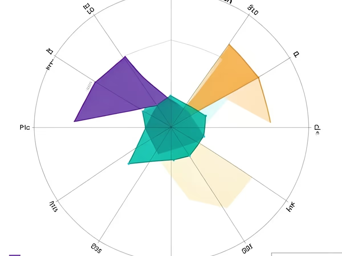
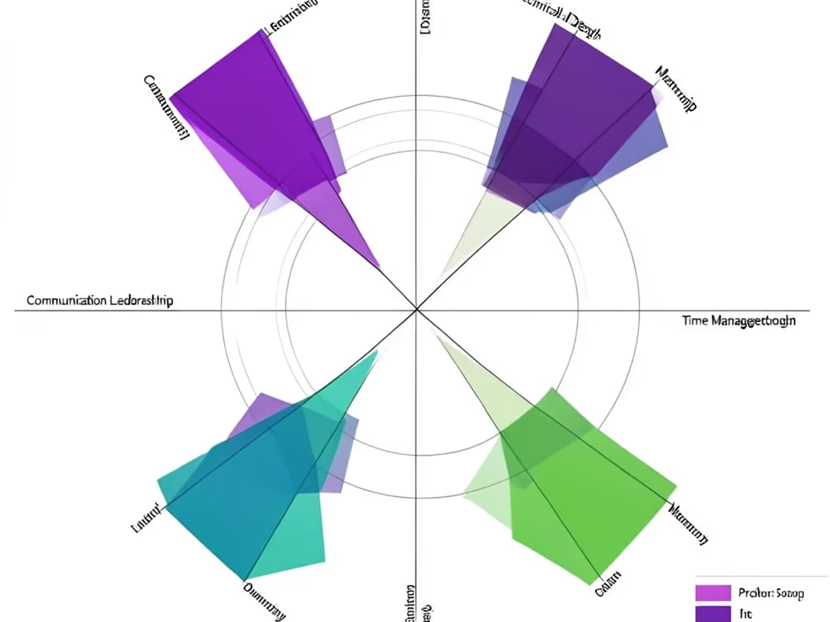
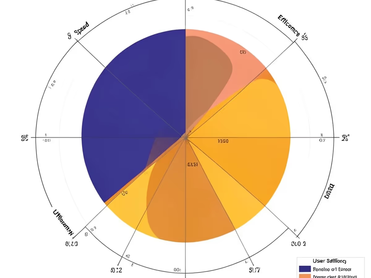
Describe your dimensions and scores in everyday language. Get a clean, labeled radar chart back — no dragging shapes or setting axis scales required.

Drop a list of 5 to 12 dimensions with their scores into the spider chart maker, and it returns a fully labeled radar chart of 1 to 6 data series roughly 5 seconds later. Analysts moving over from manual shape-by-shape tooling watch per-chart effort collapse by up to 88 percent — what used to eat 15 to 30 minutes inside a legacy spider graph maker now finishes in single-digit seconds.

Feed the radar chart generator your score rows and it places each value on the correct radial axis — 5 axes render as a pentagon, 6 as a hexagon, 8 as an octagon — then closes each series into a proportional polygon with no manual scaling. The engine handles charts as dense as 12 axes and routes up to 6 overlapping series legibly with zero label collisions. Achieving that neatness inside a conventional drag-and-drop editor typically burns 10 to 20 minutes of pixel nudging.

The spider chart creator scans input for series names — Vendor A, Vendor B, Q1 Targets, Q2 Actuals — and pairs each with a distinct color, fill opacity, and stroke weight automatically. It untangles overlapping polygons across 3 to 6 series in seconds, finishing work that eats 8 to 15 minutes of click-by-click styling inside traditional radar graph maker tools.

Mention pentagon chart, hexagon chart, or octagon chart and the spider diagram creator matches each axis count to its proper geometry — covering 3 to 12 axes across standard benchmarking layouts. Skipping the manual axis hunt saves 8 to 18 minutes per chart compared with the find-and-configure routine inside conventional pentagon chart maker software.

Grab the finished artifact as a 2048px PNG (3840px 4K on Master) for thumbnails, a vector SVG for posters or wide banners, a paginated PDF for documentation handouts, or a slide-ready PowerPoint file. Every format keeps axis labels sharp, polygon edges clean, and legend entries intact, removing the 6 to 12 minutes of reformatting that follows most export-to-deck handoffs.

Feed the radar chart creator unstructured score notes and it pulls out axis labels, series names, and numeric values at roughly 94 percent precision on the initial render. It also surfaces mismatched axis counts, missing scores, and likely typos, trimming review loops from 10 to 18 minutes down to under 3 minutes — dependable enough that analyst teams roll it out without a training phase.

Vendor matrices, competency reviews, product benchmarks — the moments that justify automation.

Procurement teams hand the spider chart maker a 100-to-300-word brief and receive a labeled 6-axis, 3-series comparison chart roughly 5 seconds later. Teams report an 85 percent drop in evaluation labor — what consumed 20 to 35 minutes of manual illustration now takes under 4 minutes of quick review. Matching that clarity inside a legacy radar chart maker generally eats 15 minutes or more per asset.

HR groups jot down 8 skill categories and per-employee scores in everyday prose and let the tool produce a structured spider graph maker output for each reviewee. A standard 8-axis, 4-series chart across 3 functional areas renders in roughly 6 seconds apiece, wiping out 25 to 45 minutes versus manual rebuilding inside a traditional editor.

Product managers write benchmark criteria in prose and let the online spider chart maker emit charts for each review session. A typical 7-axis, 2-series comparison of 5 to 10 metrics renders in roughly 5 seconds, wiping out 15 to 28 minutes of redraw work. Reviewers line the variants up to weigh tradeoffs, feature gaps, and rating shifts without redrawing a single polygon.

Consultants feed 5-criterion score summaries and priority weights into the pentagon chart maker and receive a clean 5-axis pentagon chart that calls out top strengths and gaps. A 5-axis, 3-series summary of 15 to 25 data points maps in roughly 5 seconds, against 20 to 35 minutes of manual drawing. The engine untangles overlapping series and shared axes on its own — work that regularly stalls users of legacy drawing apps.

Describe the dimensions, generate the chart, ship the file — no drawing required.

Write down axes and series in any format from a short paragraph up to 300 words. Include axis names like Price, Speed, and Support where possible, and series names like Vendor A or Q1 Targets. More detail in the input yields sharper placement on the first render.

Hit the generate button and the spider chart maker turns your text into a labeled radar chart with auto-placed axes and rendered polygons in roughly 5 seconds. Need a different series count or axis layout? Revise the prompt and regenerate — no dragging, no rescaling, no manual cleanup.

Review the output, adjust labels or swap colors if needed, then save as PNG, SVG, PDF, or PowerPoint. Forward the shareable link to reviewers or drop the file straight into your comparison report. The full sequence — from text input to shipped artifact — wraps in under 50 seconds.

faq.subtitle
Write your axes and scores, generate the chart, and ship a polished spider chart in seconds.
Type dimension names and scores to build your first radar chart.

Other AI-powered diagram tools from Arui.AI — worth a look if you found this one useful.

Turn process descriptions into structured flowcharts with AI-powered connector routing and decision diamonds.
Try Now
Turn org structure descriptions into clean hierarchy charts with auto-layout and styling.
Try Now
Turn team descriptions into structured org charts with reporting lines and department groupings.
Try Now
Turn plain-text component and connection descriptions into polished circuit schematics with IEEE symbols.
Try Now